Showing posts with label Critical studies Level 5. Show all posts

Thursday, 4 August 2011

Maya files...

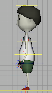
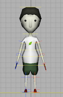
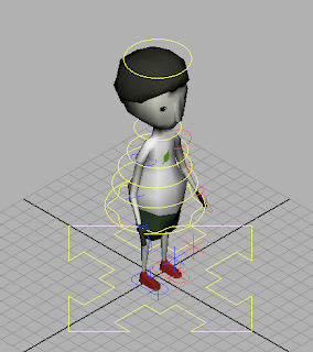
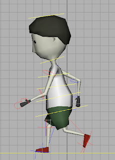
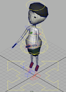
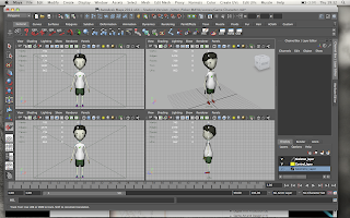
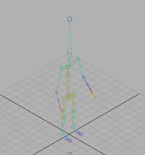
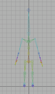
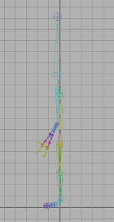
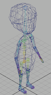
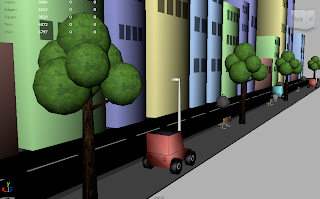
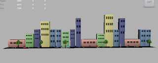
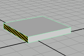
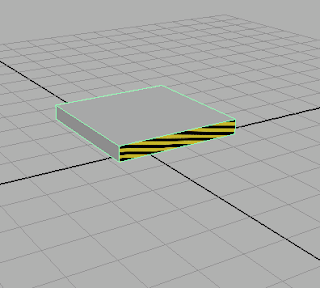
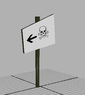
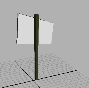
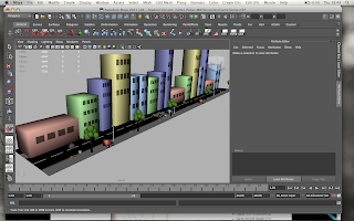
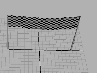
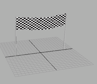
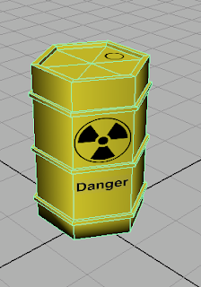
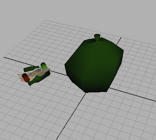
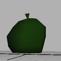
Here are the Maya files for my character and my game environment. The character is fully rigged and animated within Maya and then imported into Unity for scripting. I had to add controls to the character similar to how I created them in previous projects. Controllers are used to move the model using the rigged skeleton for the animations. The scene objects were all modeled separately apart from the game scene itself where I imported the individual objects so that I could export all of the environment at once to save time and to make it easier within Unity. The finish line and the signs were added later on in the process as it was easy to introduce new items into the scene as I was confident with the workflow required.


Tuesday, 12 October 2010

Walter Gropius title test

Here is a flv of a title I made in After Effects. I used a tutorial from the Video Co-pilot website to create a blueprint title sequence. It uses Luma inverted track mattes to create the texture for the lines. The SCRIBBLE and STROKE effects built in to After effects create the 'drawn on' animation for the lines. The lines were created with the pen tool, using masks. Auto-trace for the drawn-in outline of the name. The background is a paper texture with MULTIPLY MODE applied to the layer. Also a feathered mask for the ellipse shadow around the edges. The lines are offset animations to simulate a progressive animation. I may adapt a little to fit in with the bauhaus theme more than just using the font. It will probably be used for all of the directors names within my title sequence.

3D Bauhaus...


Here I have modelled the Bauhaus typeface into a 3d object using the text tool in Maya. I have used polygonal objects with a bevelled text. With the use of ray trace shadows to give it a soft effect, and an ambient light positioned just above the text. This could possibly be imported into my title sequence as the finishing scene. Although I will be experimenting with other techniques and decide at a later date.

Me and type...

I've always been interested in creating and designing since my early teens, from music to motion graphics. I studied graphics at A level, looking at Bauhaus, Kandinsky,Gestalt theory, Neville Brody, Colour theory etc. Building on my knowledge from Art and Graphics from secondary school. It is at college that I was introduced to typeface as a subject. At the time it didn't have too much of an impact on me. Since then typography has definitely grown on me. It is so diverse and can be manipulated easily for any purpose. From Bauhaus to Brody. Over the past year I have been introduced to 3D typeface. This has allowed me to branch out into other programs to develop my understanding of type from another perspective. As well as having After Effects at my disposal, I have the ability to broaden my development with type. Here are a few examples of what I'm interested in...


Neville Brody


Slawek Michalt


Sketchy Pictures


Matthew Carter


Nik Ainley


Stephanie Darby


Thursday, 7 October 2010

Typography

Here is a picture I did in Photoshop explaining a few simple text styles and essential typography elements. The difference between serif and sans-serif fonts is the feet on the ends of the letter stems. I have highlighted them in red at the top of the picture. Serif fonts are easier for the human eye to read and allow flow. They are typically used in books, magazines, newspapers etc. Sans-serif fonts are mainly used on websites, due to their legibility they are most suited to be read on screen.

Kerning is the spacing between the words

Tracking is the space between the characters

Vertical scale is the height of the text

Horizontal scale is the width of the text


Here is a video I made demonstrating simple moving
text intros created in After Effects


There are many ways text can come into a moving image sequence, here are a few I quickly chose as basic intros. The scaling text has a big impact as it starts at a large scale. I have used 'easy ease' key frames to allow the text to move at a gradual pace. This almost creates anticipation for the reveal as the text is obscured by its scale.
Sliding text with the use of motion blur gives an active feel. Due to its scale it comes across as inferior and almost sneaks into the frame.
The tracking text is probably my favourite here as it becomes more than just a word when tracking is applied we can't see what it will be until the reveal. The letters collapse out from the starting character evenly. It can convey a creepy effect if drawn out.
The fade in effect portrays a spooky, mystical feel. This effect works with the background more than all of rest. If used in a more complex composition the viewer is forced to see it as part of the image instead of a separate canvas overlaid.